
After two years of growing Friday Afternoons Co., it was time to take the leap and give the brand the personality it truly deserves. What started as a quick logo and color palette now needed to evolve — to reflect not just our products, but the people who use them every day.
Our planners aren’t just pretty notebooks — they’re tools designed for real life, helping busy people, moms, and ADHD brains stay organized, plan daily routines, and manage time without overwhelm. That’s why the rebrand matters to our customers as much as it matters to us.
Why We Decided to Rebrand
When FAC first started, the original designs felt right in the moment. But over time, they no longer fully represented the brand’s personality or the flexible, ADHD-friendly planning systems our customers rely on.
I wanted a look that embodies planner design, organization, and simplicity, while communicating the ease, flexibility, and calm our planners bring to daily life. Our goal is to create a brand that feels approachable, supportive, and perfectly aligned with the needs of busy, overwhelmed, and time-crunched people — the very people who pick up our planners to regain control of their days.
My Journey as a Founder
For those who don’t know me: I’m juggling being a mom of three, a full-time corporate marketing strategist, and the founder of Friday Afternoons Co. Rebranding was exciting, but I knew I couldn’t do it alone.
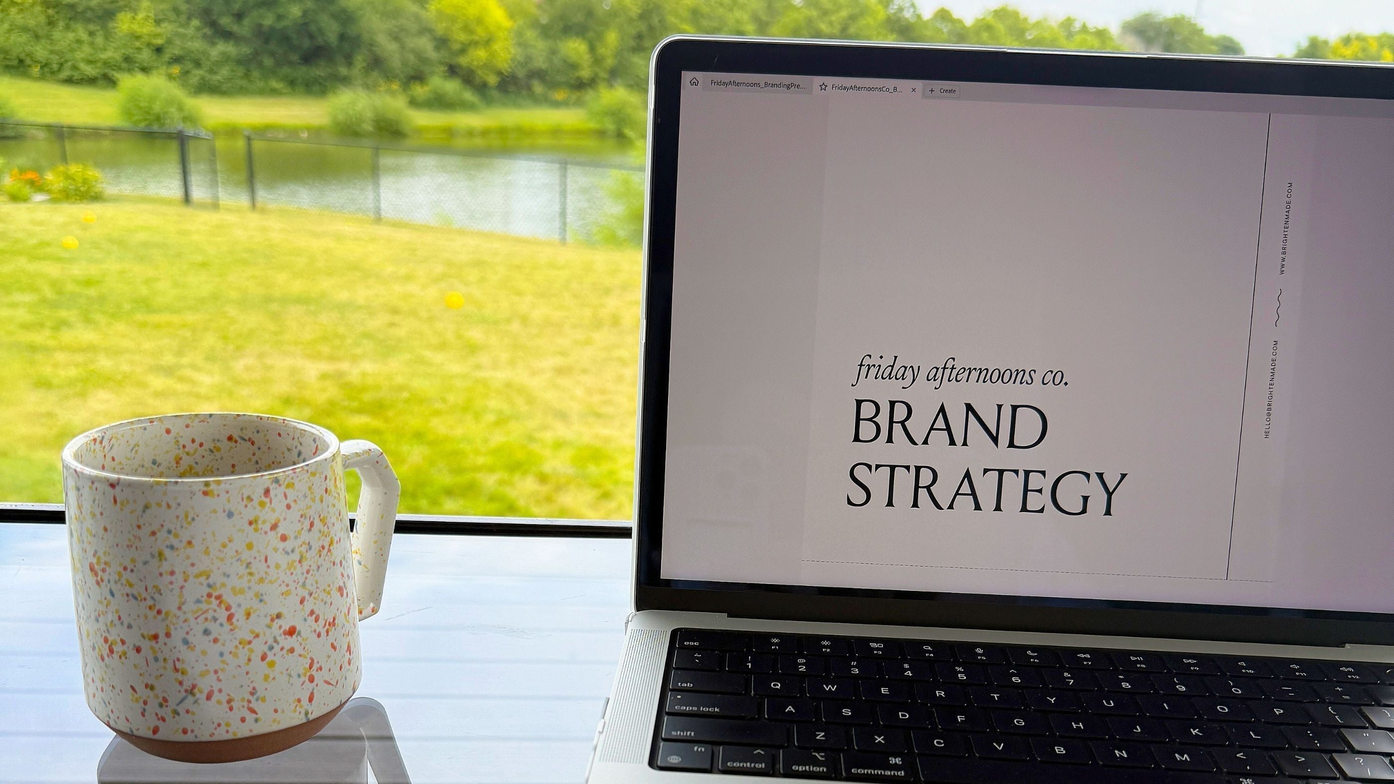
That’s when I discovered Bri at Brighten Made. Her design work captured the vision I had for FAC perfectly. Combined with their expertise in brand messaging, we’re building something special — a brand that finally feels like “us” and clearly communicates to our audience what our planners do for them: reduce overwhelm, simplify planning, and make daily organization effortless.
Why This Matters to Our Customers
Our rebrand isn’t just about a new logo or color palette — it’s about clarity, usability, and connection.
Busy moms, entrepreneurs, and anyone who struggles to stay organized deserve a planner that works for their life — not one more rigid, guilt-inducing system. Through this rebrand, we’re creating a visual identity and brand messaging that speaks directly to the people who use our planners to track their days, manage goals, and plan with intention.
This means:
-
Clear messaging that communicates the practical benefits of our undated, flexible planners
-
Designs that feel approachable, calming, and easy to use
-
Highlighting the value of ADHD-friendly, undated planners for real-life planning
What’s Next
I’m sharing this first glimpse because I initially paused social media and emails, unsure how to communicate this transition. Over the next few months, you’ll see the rebrand journey unfold in phases, including sneak peeks at our logo, color palette, and brand personality.
We’re still developing FAC behind the scenes, and I’m excited to share this creative process, brand strategy, and planner design journey with our customers — the very people who will benefit most from the new FAC experience.
Closing
Want to follow along with our rebrand journey and stay in the loop on updates, planner tips, and exclusive sneak peeks? Sign up for our email list to get the inside story and be the first to see our new look:
